
Sky Design System
Aesthetic and accessible for the end users. Efficient and productive for the designers and engineers. A robust, scalable, functioning system for Marketo Next-Gen UX built almost from scratch
Role: UX Designer (Contributor and Police)
Location: Marketo HQ
Duration: Ongoing since Mar 2018
Tools: Sketch, Adobe XD, Photoshop, Principle, Invision
Background
Sky was introduced as the new and improved experience system for Marketo (Next-Gen User Experience, if you may) back in 2017. Sky started out with pattern library model which slowly progressed to transform into a design system thanks to a collective effort from a lot of people. The Sky design system was a step in the direction towards a robust, functioning system which could be leveraged by the designers, engineers, and even product managers to steer for a more consistent and cohesive experience. The goals were to be aesthetic and accessible for the end user, and help product teams work more efficiently.
Problem Description
Almost two years after the Sky project was well underway, management of patterns via just libraries became more and more unsustainable and left all the stakeholders wanting for much more. Without any solidified guidelines, inconsistencies crept in and kept on growing (surprise!). Constantly battling UI bugs in JIRA and then having over the desk or slack discussions with designers to triangulate the expected design pattern became a dangerous practice. And that triggered the Sky Design System journey. Unambiguous guidelines, consistent and componentized design elements, atomic design principles became the pillars on which the system was to be built. Bold, approachable, empowering and reliable defined the personality. And, later we would iterate more to make it WCAG2.0 AA accessible compliant. It soon became the most integral part of all designers workflow, the backbone of our design process if you will.
I want to touch upon 2 of the elements most dear to me that I worked on and contributed to the design system
Colors
Pre Design System
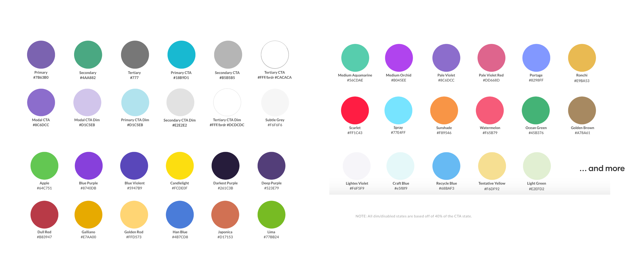
One of the most essential atoms in a design system. I was fortunate enough to be involved with deciding the palette for our platform. Before we started, there were more than 30 different colors plus their shades which were just being used based on every designers own liking. One of the first tasks we did, was run an audit to see what colors are being used in what place
Post Design System
We started striping out most of the colors, and replacing them with shades of grays. Coming up with shades of any color is one of the crucial decisions in deciding the palette. You need to provide just enough shades and tie them to strict guidelines of usage so that there is consistency and a clear logic (also, less rainbows floating around). We also turned to marketing to seek out what brand colors were being used; we didn’t want to miss out on the core identity - the famous Marketo purple.

Playing with the hues, and brightness took quite some math skills all to also be compliant with the WCAG 2.0 contrast ratios. As you can see, we considerably stripped out colors and brought a whole new world of guidelines and categories. Having a set naming convention and a common meaning associated with those names definitely worked well when communicating among designers and engineers. It also helped bring a whole new level of visual consistency in the platform and we had barely even started to fix the component level inconsistencies.

The other challenging juncture was defining the data visualization palette for Marketo. That was one area that had absolutely nothing in terms of a basic palette, use cases defined, or even reporting and data usages spelled out at a feature level. So I had to go digging into firstly what are the needs that Marketo currently has or will have in the future. Then a ton of research as to see how others out there tackle these situations and how to form a palette that is aesthetic, scalable, and more contrast compliant.
Twilight then was born out of looking at the colors in nature, the sort of gradient everyone is kind of familiar and kind of love - the sunset and sunrise colors in the sky. Having such a palette also does not feel out of place to any user, as they are more than familiar looking at those colors together.
Date Picker
The other molecule I worked for a long time to get right and which faced the most challenges was the good old date picker. What also made it so interesting was that no other component we worked on was as intricate and filled with tens of different edge cases and error handling, varied use from feature to feature and context to context, and no other component had required us to spell out interaction details at such fine levels. To round up all of it and fulfill 95% use cases without creating 4 different components was a fun challenge.
Pre Design System
The date picker took close to 10 months to come to fruition. There were dependencies on other input fields to be first designed and built, for date picker to be componentized. The early implementation being used had also met with some user frustration, making it among the first components to get user attention (if a user notices something in the middle of their workflow, it's either really bad or something really cool)
Challenges
Date and time pickers were used throughout the platform, all with different usage contexts. The implementation back then was not coded to handle them all gracefully.
The use cases were no where to be documented, no product manager knew the full extent of usages of these pickers.
Engineering had their own concerns about the library being used and error handling with different user inputs.
The usability of the current version was a big issue. User tests constantly showed people getting confused and not using it the way it was intended to be

Early Iterations
The biggest piece we went back and forth during those iterations was the input field. Whether to keep an open accept-all-text box, or a strict select-from-panel picker without any text input. Given that engineers had the biggest headache of handling and parsing the textual input, the strict select only method seemed tentative.


The other characteristic in focus was to consolidate the different kind of date and range pickers in a way that we could use a single component to satisfy more use cases.
Post Design System
After weeks of gathering requirements, use cases, and understanding the engineers pain-points, a number of iterations, and a lot of feedback we came up landed on a final component design. Taking into consideration all other feedback and use cases, an open text field would suit the best. Also gives a better experience when it's used purely via a keyboard. We also decided to stick with the modular approach of the re-using 2 components to satisfy broader use cases - a date picker and a time picker. The combinations would solve for all date picking, time selection, date range selection, date and time range selection.

An open field meant spelling out all possible error cases. Also detailing out the interactions for different scenarios. It sure looks simple now, but did take quite some effort to land on the final decisions
Recent Updates
Marketo then got acquired by Adobe, and they have their own (huge) design system - Spectrum. We are now assessing how we can now merge Sky in spectrum. We just concluded a component level audit to identify the gaps, the elements we can borrow, and the ones we would need to contribute back to Spectrum. We are now working with our engineers to fill these gaps and then hopefully transition over to Spectrum as it is immensely more comprehensive than ours.
Key Takeaways
The challenge of building a new Design System from ground up had its own kind of fun. Though atoms, molecules, organisms would seem complicated, it really is not
Working with colors and contrast ratios introduced me to the world of palette creation and management techniques. Also, math is tiny bit important in design
Managing the design system after the system matures a bit is quite rewarding. To have such an impact for a huge enterprise platform is a different kind of satisfaction